|
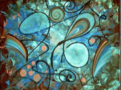
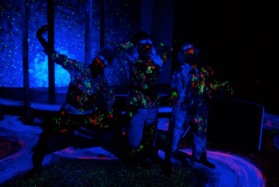
After much experimentation and review, we chose Rosco Clear Colour as our black light paint. We found that painting the floor for the overworld was a straightforward scenic process: base coat, spatter, texture details and glazes.
We discovered that starting on a well-sealed surface worked well for applying the Clear Colour. We also found that painting under a black light fixture made the process much easier. Under white lights, the paints are a cloudy white, not unlike Rosco Clear Flat. So, in many situations, particularly when you're applying the Clear Colour to a light colored background, it's hard to see where you have applied it! You can see here a series of photographs detailing the progression of our paint process.
We added blue texture to the top of white swoops. (We learned that, for our application, we got better results if we applied Clear Colour on a sealed surface.)
Our next step was to add the red and green Clear Colour paint as accents to the blue. Green Clear Colour was also used as spatter in the dark voids. We wanted to preserve the luminosity of the green and red as much as possible, so we diluted those colors only enough to allow them to fly off the brush. Because these colors could not be brushed flat, this resulted in thicker deposits of consequence, since it blended well with the underpaint.
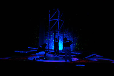
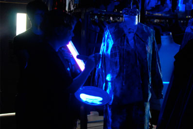
Once the floor was complete, we painted the vertical surfaces of other scenery and got similar good results. We accented the edges of the ramp and the elevator with blue paint. This added a great sense of verticality to the set when we traveled to the underworld. (Figure 3). An unexpected benefit to the Rosco Clear Colour paints was how well they worked on fabrics.
|